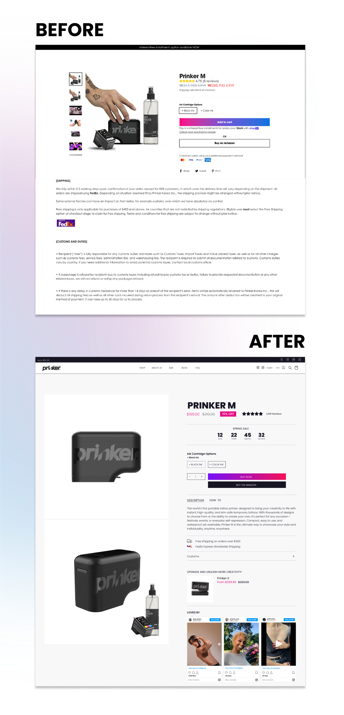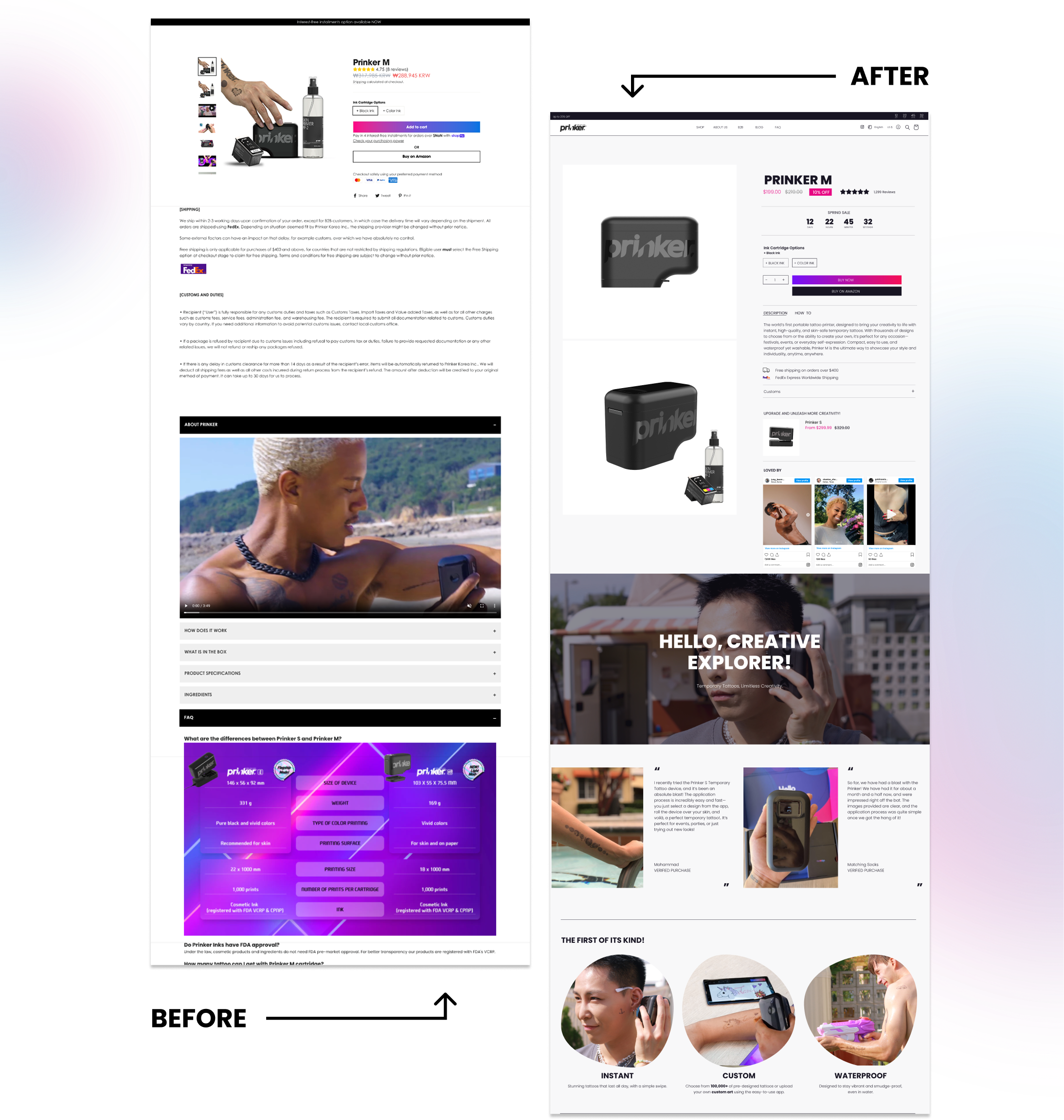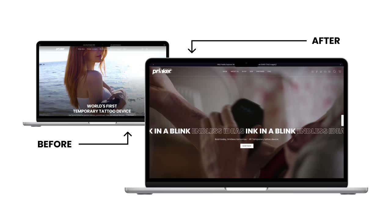

After a deep-dive audit of Prinker’s website, we identified the core issue: while the product was high-tech and premium, the website failed to convey the same level of credibility and innovation. This disconnect was creating hesitation at the point of purchase, especially given Prinker’s higher price point.
We restructured the site content and proposed a new wireframe designed to:
- Introduce the Prinker brand and technology with greater clarity
- Build trust through social proof, press mentions, and certifications
- Highlight product benefits with real-life use cases and visuals
- Guide users through a simplified, persuasive buyer journey
When it comes to design, Prinker’s previous website had a number of usability and design issues. The site lacked a clear structure and often redirected users to multiple external domains, which made the experience feel disjointed. Some sections used oversized images that overwhelmed the layout, while others felt too sparse. Collection pages were difficult to navigate, and key product information was buried or inconsistent.
To create a more polished and user-friendly experience, we migrated the site to a clean, modern Shopify theme that puts the product front and center. Here's what we focused on: